COMPANY
기술력과 노하우로 이루어 낸 세신의 제품을 소개합니다.
C.I
Our manufacturing facility is our company’s pride.
SAESHIN C.I

Symbol Mark and Logo (Regular or Grid)
The logo is a representation of a visual expression that symbolizes SAESHIN PRECISION which is a core fundamental factor. Internally, the logo makes every employee feel a sense of unity, and delivers a consistent image that creates more synergy.TRAUS C.I

Symbol Mark and Logo (Regular or Grid)
The name TRAUS has the meaning of “dreams” and got the name from a “Growing Tree”. We are emphasizing on “T” which has the meaning of Technology, Trend, etc. Branches which are divided into two will be the foundation of creating the Saeshin Precision brand. The Blue color signifies the company’s desire to produce superior technology and reliability.SAESHIN PRECISION CO, LTD,
A company of an iron hand
in a velvet glove

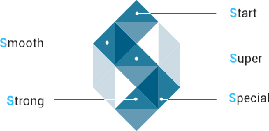
Meaning of Formation It denotes brightness, nobility and timelessness of SAESHIN PRECISION CO., LTD expressing its initial ‘S’ with a diamond. The image that the light penetrates the diamond means technology and passion of SAESHIN PRECISION CO., LTD which leads for a better healthy life for humankind. Moreover, the ‘S’ means various words including Sincere, Strong, Special, and Supreme so that it can be considered a symbol of a special beginning of SAESHIN PRECISION CO., LTD to open the new stage of the medical appliances business in the global age.
Meaning of color Blue-mono tone was used to represent the high-tech industry. An image of SAESHIN who aims to become a company that delivers only the highest technology.
Integrated meaning Ideal combination of accurate formation and color expresses the properties of SAESHIN PRECISION CO., LTD which leads the industry as a member of the high-tech products arena.
Exclusive color

In addition, it is applied to symbol mark, logo type and visual medium, and it functions to transmit the image of Seishin Precision Co., Ltd. Exclusive color representation is based on four primary color processes. If there is any doubt in production, be sure to consult with CI management department.
Main Color
-
CMYK 100 / 20 / 0 / 40
RGB 0 / 102 / 156
-
CMYK 80 / 16 / 0 / 32
RGB 0 / 124 / 174
-
CMYK 60 / 12 / 0 / 24
RGB 79 / 152 / 193
-
CMYK 20 / 4 / 0 / 8
RGB 201 / 220 / 235
Sub Color
-
CMYK 11 / 100 / 0 / 0
RGB 212 / 0 / 127
-
Gold
-
Silver
-
CMYK 0 / 2 / 0 / 60
RGB 137 / 135 / 136
TRAUS B.I

Fundamentals of the Word Mark
The name TRAUS has the meaning of “dreams” and got the name from a “Growing Tree”. We are emphasizing on “T” which has the meaning of Technology, Trend, etc. Branches which are divided into two will be the foundation of creating the Saeshin Precision brand. The Blue color signifies the company’s desire to produce superior technology and reliability.Exclusive color
Main Color
-
CMYK 100 / 17 / 0 / 51
RGB 0 / 90 / 138
-
CMYK 0 / 2 / 0 / 60
RGB 137 / 135 / 136
Sub Color
-
TRAUS Gold
-
TRAUS Silver
-
CMYK 59 / 0 / 100 / 7
RGB 109 / 179 / 40
Brillian B.I

Fundamentals of the Word Mark
The logo is a representation of a visual expression that symbolizes Brillian which is a core fundamental factor. Internally, the logo makes every employee feel a sense of unity, and delivers a consistent image that creates more synergy. Along with our logo, the Word Mark is the core of the B.I logo, and one of the essential elements to visually convey the identity of Brillian.Regulation a color
Illegal use of the Symbol Mark may damage the identity of Brillian. To present or use the images correctly, keep it exactly the way it appears in the illustrations above.
Exclusive color
Main Color
-
CMYK 0 / 0 / 0 / 0
RGB 0 / 0 / 0
-
CMYK40 / 45 / 50 / 5
RGB 155 / 133 / 120
-
CMYK 65 / 60 / 0 / 0
RGB 106 / 110 / 179
Sub Color
-
CMYK0 / 39 / 30 / 0
RGB 248 / 173 / 160
-
CMYK0 / 0 / 0 / 30
RGB 188 / 190 / 192

 EN
EN  KOREAN
 CHINESE